Video
29.04.2026
If you’re still choosing color temperature by eye… you’re working without a real method


29.04.2026
“Let’s choose a light that’s not too warm and not too cold.”
It’s a phrase we hear very often in the lighting industry — and especially in the elevator sector.
But when numbers such as 2700, 3000, 4000, 5000 start appearing on labels, followed by a K, there’s a real risk that the choice is made by intuition rather than by a clear, structured method.
And that’s exactly where this article — and the video that accompanies it — comes from.
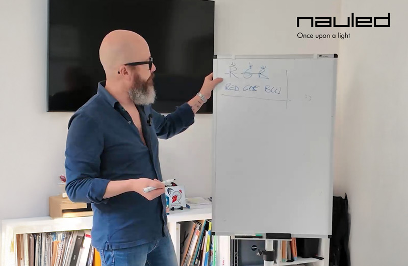
The color temperature of light is measured in Kelvin degrees and is indicated by the letter K.
That marking on the labels of:
- light bulbs,
- LED strips,
- spotlights,
- ceiling lights,
is not a commercial detail, but a fundamental technical specification: it indicates whether the light appears warm, neutral, or cool.
The first aspect that often causes confusion is this:
- the warmer the light, the lower the Kelvin value,
- the cooler the light, the higher the Kelvin value.
It’s a counterintuitive concept, but an essential one for making the right choices.
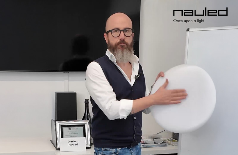
In the video, we walk through the most common color temperature ranges available on the market in a simple, practical way.
- Warm light:
2700 K: a very warm light, comparable to the old incandescent light bulb,
3000 K: still considered warm, often used in residential settings such as kitchens or welcoming environments.
- Neutral light:
4000 K – 4500 K: the classic neutral light, used in most offices and work environments.
- Cool light:
5000 K – 6500 K: very cool light, used for specific and technical applications, sometimes even outside traditional lighting contexts.
These values are not subjective interpretations: they are well-defined ranges that help predict the visual effect of light even before installation.
There’s an interesting fact we discuss in the video:
around 90% of elevator cabins are illuminated with 4000 K light.
Why does this happen?
For convenience?
Out of habit?
Because it’s a “middle ground” between warm and cool?
Probably a mix of all these reasons.
But the truth is that choosing the same color temperature every time is not a method — it’s a shortcut.
Deciding on a color temperature without considering:
- cabin materials,
- finishes and colors,
- dimensions and geometry,
- how users perceive the space,
means giving up a fundamental part of the design process.
Light is not only about “seeing”.
It’s about defining space, making it more welcoming, safer, or more consistent with the overall installation.
And this is where method makes the difference.
Looking at Kelvin values means working consciously.
Understanding what Kelvin degrees really represent allows you to:
- anticipate the final visual effect,
- reduce mistakes and second thoughts,
- avoid corrective interventions later on,
- enhance the installation instead of flattening it.
▼ Watch the video
Color temperature is not a number to copy from another installation.
It is a design tool.
When it is chosen with method, light stops being a detail and becomes an integral part of the system.
And that’s always where the real difference begins.
If you also want to understand how to choose the right color temperature for your project, the first step is always the same: gain clarity. -> book a call with us